Restaurant Reviews App – Stage 1
My Udacity Student Project (1/3)
The Challenge
Project Overview
For the Restaurant Reviews projects (Udacity), the task is to incrementally convert a static webpage to a mobile-ready web application. In Stage One, I had to take a static design that lacked accessibility and convert the design to be responsive on different sized displays and accessible for screen reader use. I also began converting this to a Progressive Web Application by caching some assets for offline use.
Here is a short video explaining the overview of the project.
Specification
I was provided base code for a restaurant reviews website. The code had a lot of issues. It was barely usable on a desktop browser, much less a mobile device. It also did not include any standard accessibility features, and it did not work offline at all. My job was to update the code to resolve these issues while still maintaining the included functionality.
Requirements
Make the provided site fully responsive. All of the page elements had to be usable and visible in any viewport, including desktop, tablet, and mobile displays. Images could not overlap, and page elements were not allowed to wrap when the viewport is too small to display them side by side.
Make the site accessible. Using what I learned about web accessibility, I made sure that altattributes are present and descriptive for images. I added screen-reader-only attributes when appropriate to add useful supplementary text. I also used semantic markup where possible, and aria attributes when semantic markup was not feasible.
Cache the static site for offline use. I used the Cache API and a ServiceWorker, to cache the data for the website so that any page (including images) that has been visited was accessible offline.
Steps to Complete
- Fork and clone the starter repository. The code in this repository will serve as your baseline to begin development.
- You will need a MapBox API key. Replace the text
<your MAPBOX API KEY HERE>inside ofmain.jswith your key. MapBox API is free to use, without providing any payment information. - Convert the provided site to use a responsive design .
- Bootstrap and other CSS frameworks should not be used; all responsiveness should be done with CSS.
- Use appropriate document type declaration and viewport tags
- Create a responsive grid-based layout using CSS
- Use media queries that provide fluid breakpoints across different screen sizes
- Use responsive images that adjust for the dimensions and resolution of any mobile device
- Implement accessibility features in the site HTML (most of this HTML is generated by JavaScript functions).
- Add a ServiceWorker script to cache requests to all of the site’s assets so that any page that has been visited by a user will be accessible when the user is offline. Only caching needs to be implemented, no other ServiceWorker features.
Make sure your code adheres to our HTML, CSS, JavaScript, and Git style guidelines.
Project Rubric
Responsive Design
| CRITERIA | MEETS SPECIFICATIONS |
|---|---|
| Is the site UI compatible with a range of display sizes? | All content is responsive and displays on a range of display sizes.
Content should make use of available screen real estate and should display correctly at all screen sizes. An image’s associated title and text renders next to the image in all viewport sizes. |
| Are images responsive? | Images in the site are sized appropriate to the viewport and do not crowd or overlap other elements in the browser, regardless of viewport size. |
| Are application elements visible and usable in all viewports? | On the main page, restaurants and images are displayed in all viewports. The detail page includes a map, hours and reviews in all viewport |
Accessibility
| CRITERIA | MEETS SPECIFICATIONS |
|---|---|
| Are images accessible? | All content-related images include appropriate alternate text that clearly describes the content of the image. |
| Is focus used appropriately to allow easy navigation of the site? | Focus is appropriately managed allowing users to noticeably tab through each of the important elements of the page. Modal or interstitial windows appropriately lock focus. |
| Are site elements defined semantically? | Elements on the page use the appropriate semantic elements. For those elements in which a semantic element is not available, appropriate ARIA roles are defined. |
Offline Availability
| CRITERIA | MEETS SPECIFICATIONS |
|---|---|
| Are pages that have been visited available offline? | When available in the browser, the site uses a service worker to cache responses to requests for site assets. Visited pages are rendered when there is no network access. |
My Solution
Main Page
Large Size (Desktop Version)
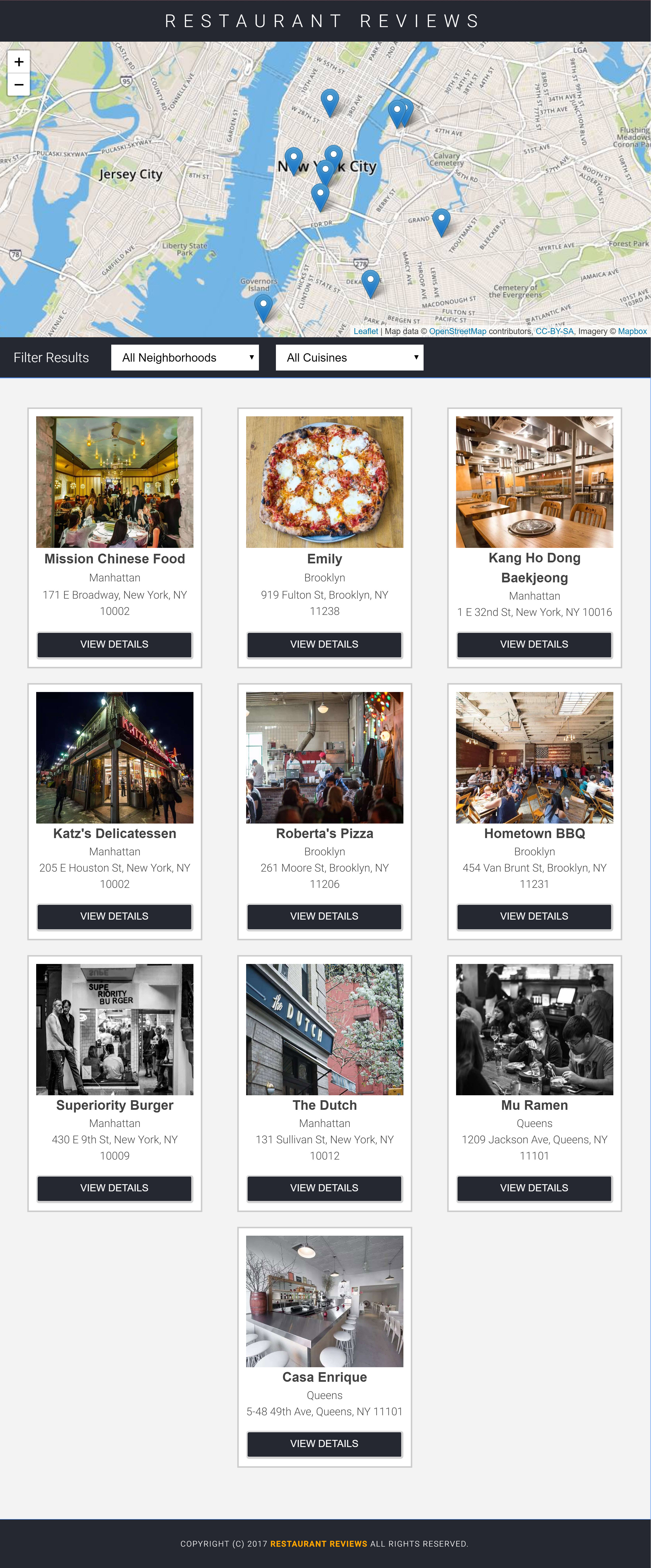
Main Page – Desktop Size
Main Page – Tablet Size
Main Page – Tablet (medium size)
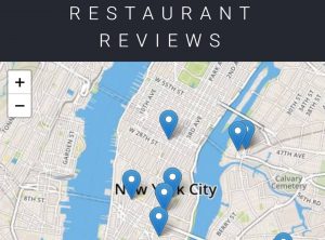
Main Page – Mobile Size

Main Page – Mobile (small size)
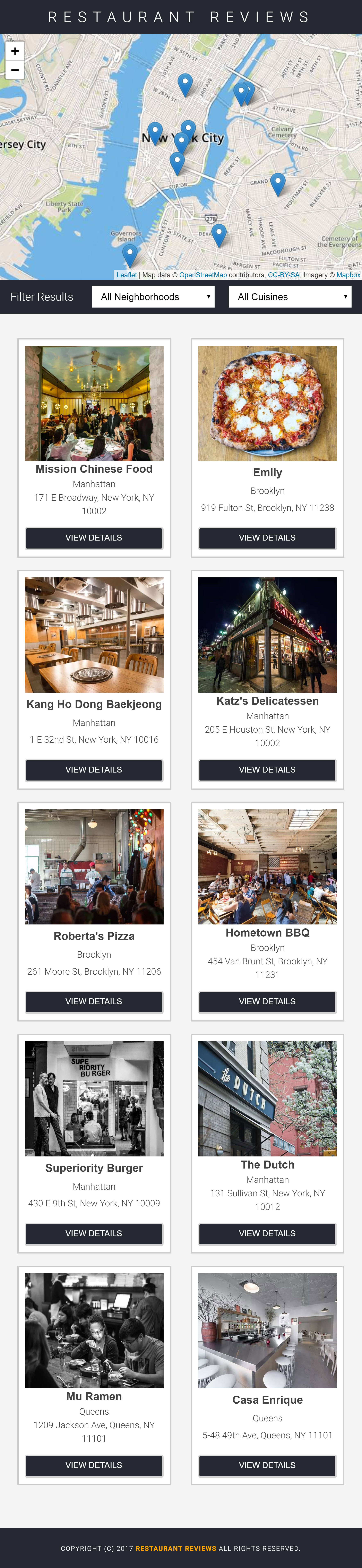
Details Page
Desktop (Large Size)
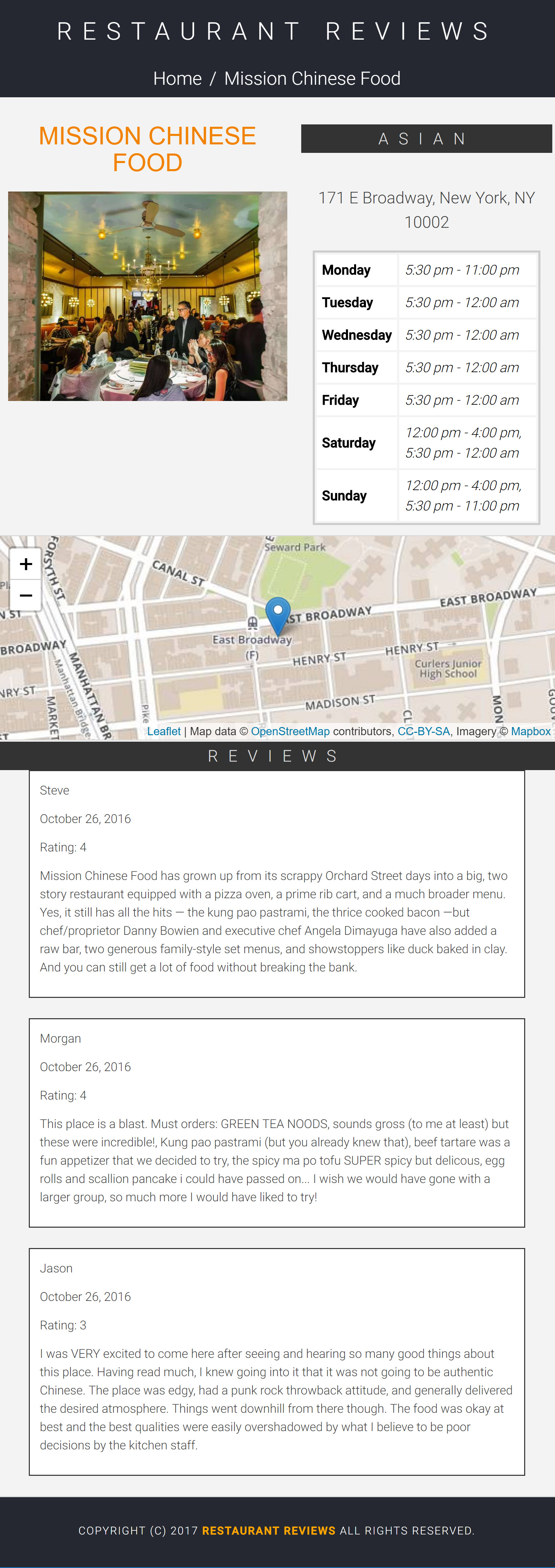
Details Page (Large Size)
Tablet (Medium Size)
Details Page (Medium Size)
Mobile (Small Size)
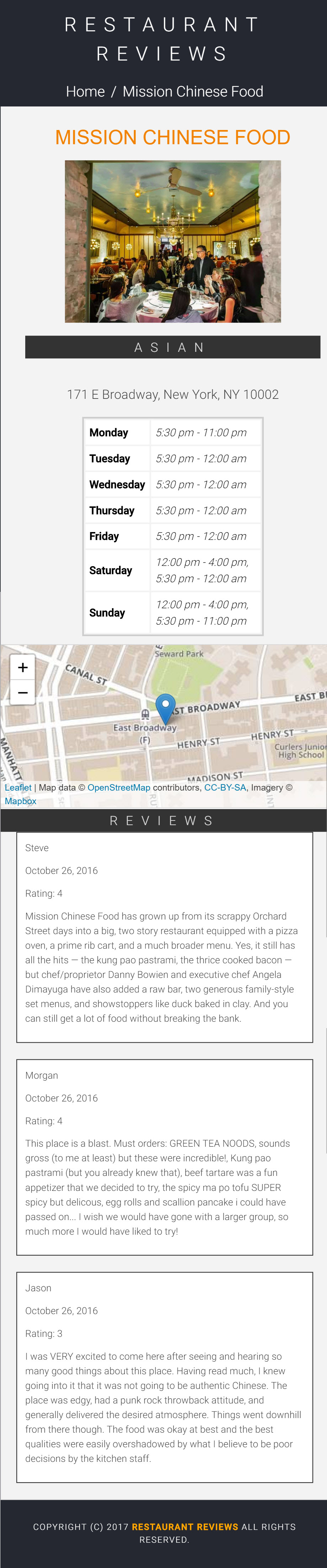
Details Page (Small Size)
My Demos
Responsive and Offline First
My Aria Accessibility Demo – Restaurant Info Details
Aria Accessibility for My Restaurant Reviews App – Main Page
My Code
My code for this project is available to download for free from my GitHub account. You can view and download my code repository for the project here.